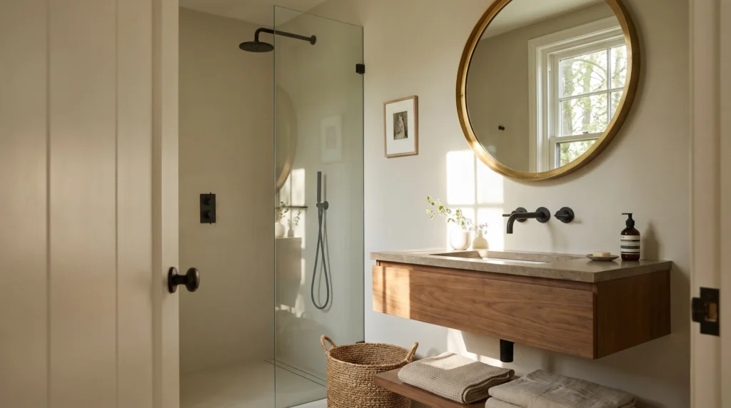
For a small bathroom, the instinct is to paint everything stark white. But it doesn’t need to be white floor-to-ceiling to feel spacious — and the palest possible color chosen without considering lighting can leave the room cold, flat, or surprisingly cramped. The same soft green or warm beige that feels airy in one bathroom looks heavy in another. Choose by light, existing surfaces, and desired contrast — not by reaching for the brightest white on the chart.
Quick Color Decision Guide
Very dark / little daylight: warm white or pale warm neutral.
Bright natural light: sage, pale blue, or greige.
Lots of white fixtures: warm neutral or soft muted color.
Warm wood / brass accents: warm white, beige, or sage green.
Maximum spaciousness: light, low-contrast color.
Dramatic atmosphere: deep saturated color (best in powder rooms).
The All-White Myth
White reflects light and looks clean — but brightness and spaciousness are different things. A stark white bathroom with dark grout, a dark vanity, and lots of separate visual elements feels busy: the eye stops at every boundary, and the space reads choppy. The best small-bathroom colors aren’t necessarily the lightest — they’re the ones that create the most visual continuity.
Start With the Natural Light
A large window handles color completely differently from a small frosted one or no daylight at all — because paint undertones shift with light. A pale beige that’s warm and inviting in daylight can look considerably darker under artificial bulbs. Pro tip: check the Light Reflectance Value (LRV) on the paint swatch (0–100 scale) to compare how much light colors reflect — but remember lighting, sheen, surroundings, and time of day still change the final look. Little daylight → lighter, warmer colors are safer. Bright room → more freedom with subtle color.
Warm Whites Beat Stark Whites
Warm whites carry subtle beige, cream, or yellow undertones that soften a room without adding visual weight — especially with natural materials, warm wood cabinetry, brass or aged-metal finishes, and natural stone. But test carefully: some warm whites turn noticeably creamy under warm artificial light, and bright white fixtures can make an overly creamy wall look unintentionally yellowed.
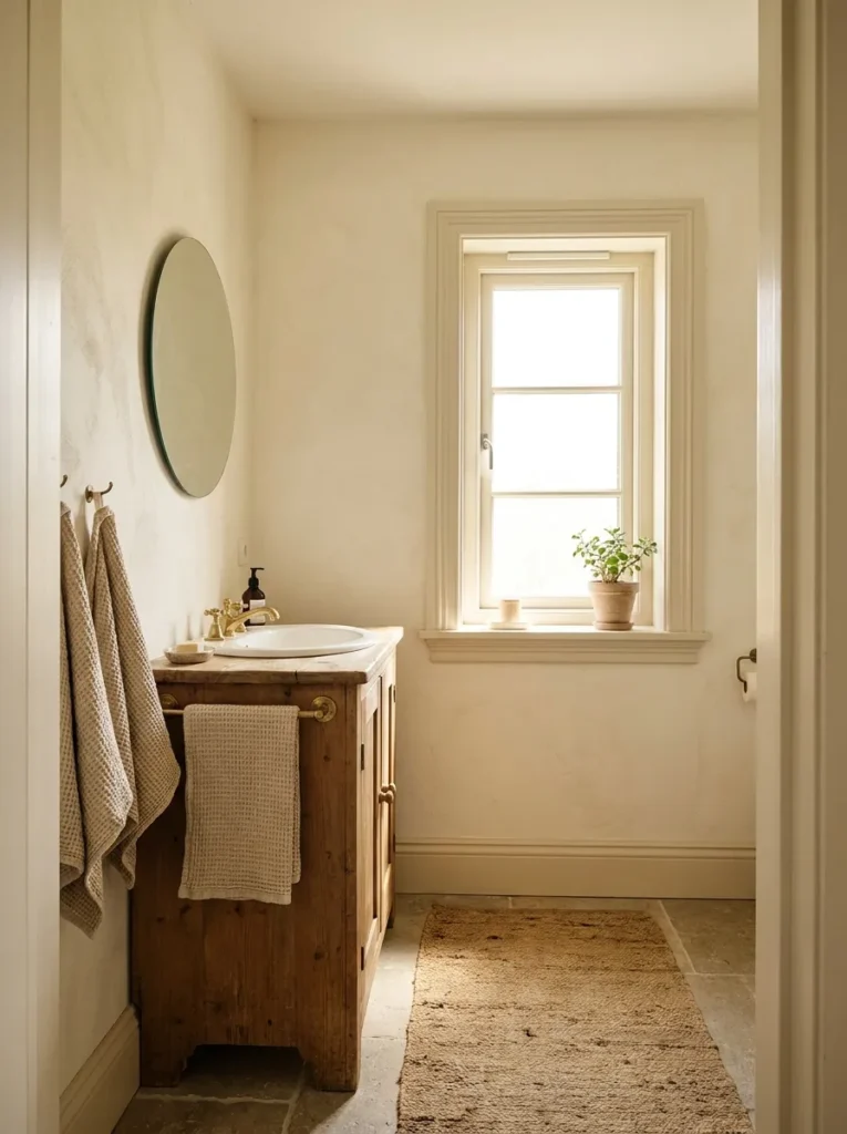
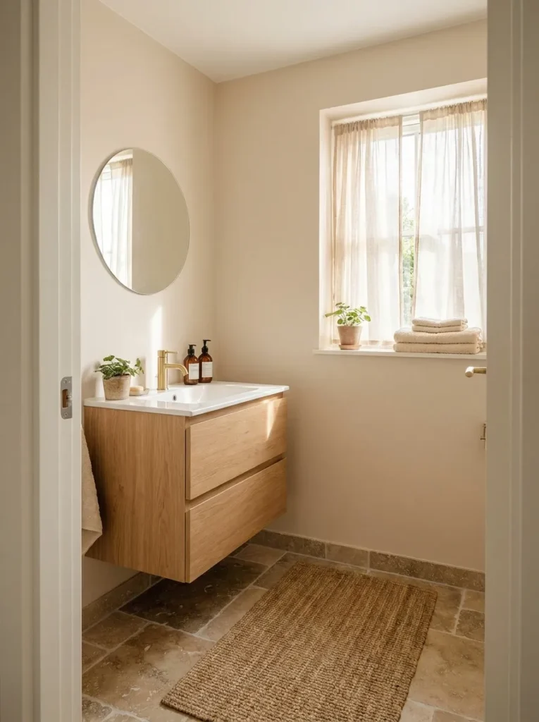
Soft Beige Adds Warmth Without Weight
The right beige — soft and light, not deep or heavily saturated — is genuinely effective in small bathrooms. Pale beige softens white fixtures, warms the atmosphere, and pairs naturally with light wood, stone-look flooring, and woven accessories. With limited daylight, avoid beiges that are too gray or too dark — they’ll dim the room further. Choose soft beige when: the bathroom feels cold from bright white fixtures or lacks warmth, and you want a neutral that works with wood, stone, or warm metals.
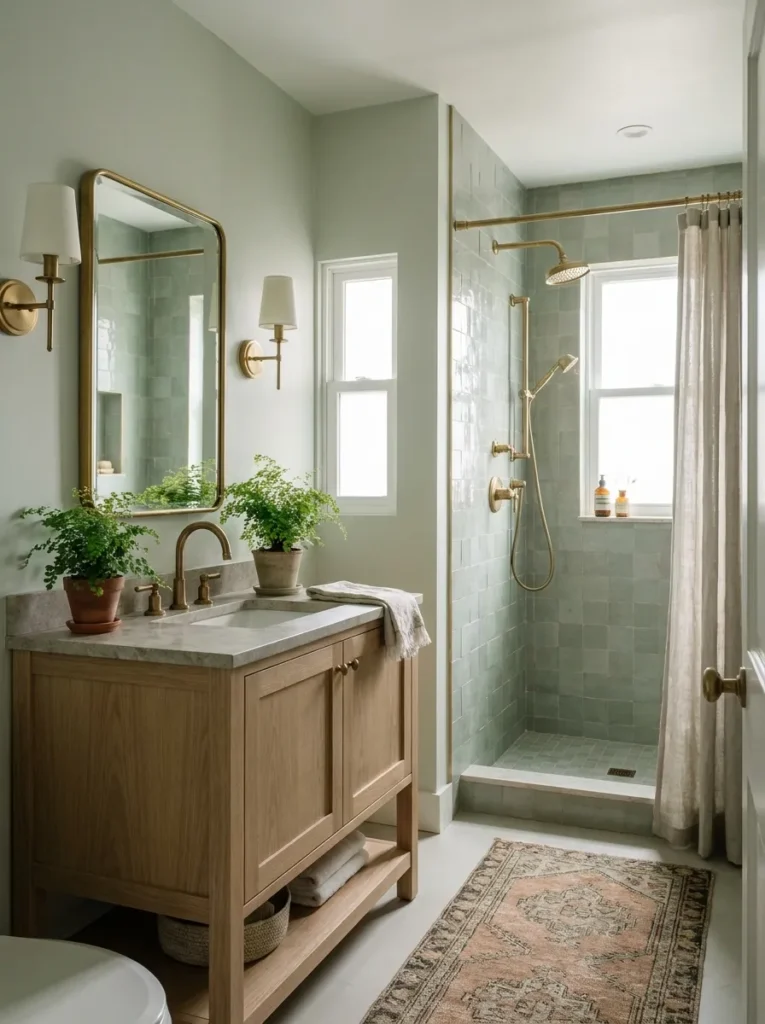
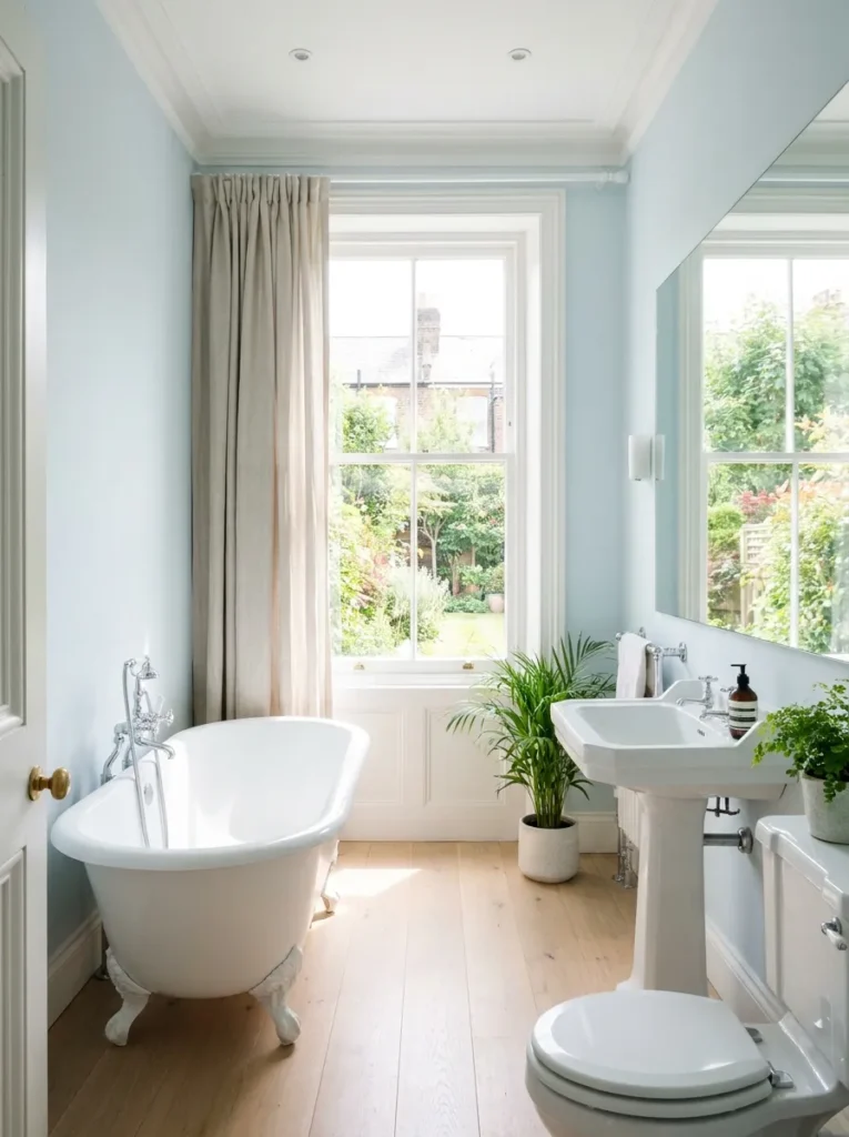
Undertones: Pale Green, Soft Blue, Greige
Pale green: grounding and natural — muted sage and gray-green feel far calmer than bright greens. Choose when the bathroom has warm wood, natural stone, or brass and you want color without strong contrast.
Soft blue: fresh and airy — but very cool blues can feel clinical in low-daylight bathrooms. Choose when the room gets good natural light and you want a crisp, clean atmosphere.
Soft greige: between gray and beige — the versatile neutral that’s neither stark nor overly warm. Choose when you need a bridge between cool white fixtures and warmer flooring.
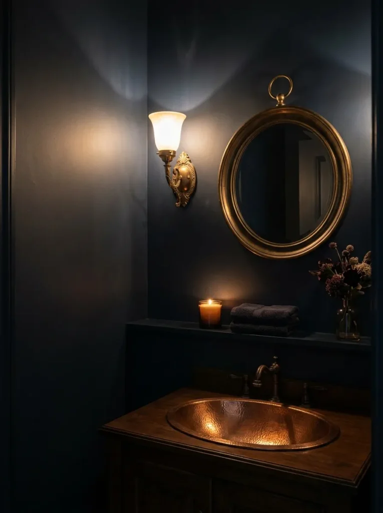
What About Dark Colors?
Dark colors aren’t automatically wrong — they create a completely different effect: intentional, intimate, dramatic rather than cramped. This works exceptionally well in a powder room, where bright expansiveness isn’t the priority. Just be honest: dark won’t make the room physically larger. Light colors for spaciousness; dark colors as a deliberate design choice when atmosphere matters more.
Let Ceiling and Trim Support the Color
You don’t need a sharp boundary between every surface. A wall color continuing onto trim or ceiling creates seamless continuity; a bright white ceiling above colored walls creates a strong visual break. For a softer room, use a closely related tone — or color-drench the entire space to erase harsh contrast.
Use Contrast Carefully
Contrast gives definition, but too much fragments a small bathroom. Keep large surfaces (walls, floors, vanities) relatively similar in tone; reserve stronger contrast for small elements — faucets, mirror frames, vanity lighting, cabinet pulls. Large areas: continuity. Small details: contrast.
Don’t Ignore Existing Tile
Paint is only half the decision. Tile, flooring, countertop, and vanity undertones must influence your choice — a beautiful swatch can clash terribly with your shower tile’s undertones. Study the tile in natural daylight: does it lean warm, cool, gray, cream, pink? Working with your existing hard finishes beats any generic “makes it look bigger” rule.
Before You Commit
Step into the bathroom and name what bothers you: does it need more warmth, less visual clutter, a softer backdrop for white fixtures? There’s no magic color that adds square footage. Start with the lightest color that works with your existing tile and lighting — not necessarily the lightest color on the chart. And choose a washable, moisture-appropriate finish: our paint finish guide covers what bathrooms need.
Quick Answers
What color makes a small bathroom look bigger?
Light, low-contrast colors with good visual continuity — warm whites, soft beiges, pale sage, soft blue, greige. Match the choice to your lighting and existing tile undertones, not just the paint chart.
Should a small bathroom be all white?
Not necessarily. Stark white with high-contrast fixtures and finishes can actually feel busy and choppy. Warm whites and soft neutrals usually create a more spacious feeling than brilliant white.
Can I use dark paint in a small bathroom?
Yes — as a deliberate design choice, especially in powder rooms where atmosphere beats expansiveness. Dark colors create intimacy and drama; they just won’t make the room feel physically larger.
Affiliate Disclosure: As an Amazon Associate, I earn from qualifying purchases. If you click a link and buy, I may receive a small commission at no extra cost to you. Thank you for supporting my content!