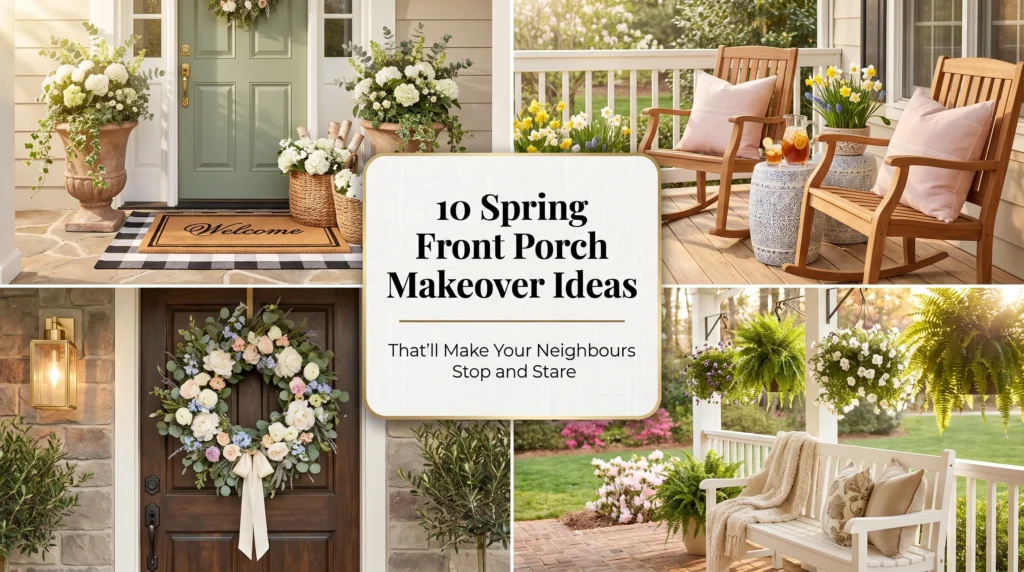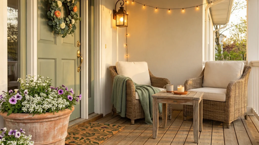
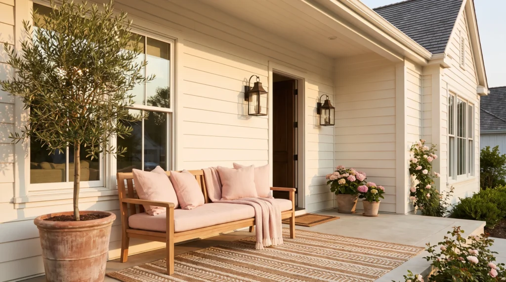
Soft pink has become one of the most popular accent colours in home décor, bringing warmth, charm, and personality to outdoor spaces. Used thoughtfully, it makes a porch feel welcoming, sophisticated, and timeless. Yet not every pink porch creates the same impression: some feel calm and beautifully curated, others overly themed, visually busy, or hard to style year-round. The difference rarely comes down to the colour itself — it comes from the decisions surrounding it: how much pink is used, which shades are chosen, what materials balance it, and how the rest of the space supports the design. If you’re dreaming of a porch that feels soft and stylish without becoming overwhelming, this guide will help you make choices that create lasting elegance instead of short-lived trends.
Start With the Right Shade of Pink
Not every pink creates the same atmosphere. Bright bubblegum or neon pink quickly dominates an outdoor space, especially with bold accessories. Softer tones blend naturally with outdoor textures and colours: blush, dusty rose, muted mauve, and warm pastel pink complement natural materials rather than competing with them. When choosing paint, cushions, planters, or accents, think of pink as a supporting colour, not the main attraction. The goal isn’t making visitors notice the colour first — it’s making the entire porch feel calm, welcoming, and thoughtfully designed.
Let Pink Be an Accent, Not the Palette
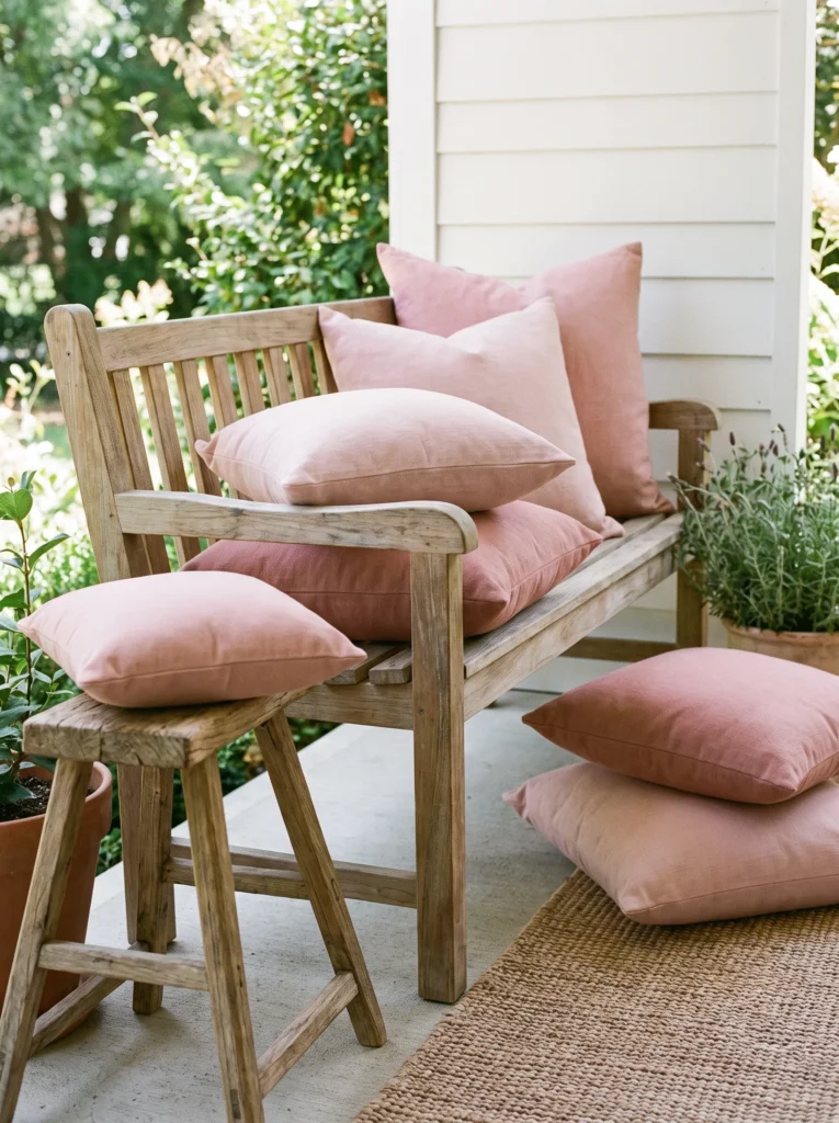
The biggest reason a pink porch feels overdone: using the colour everywhere at once. Pink furniture, pink cushions, pink planters, pink flowers, pink rugs — when every element shares the same colour, nothing stands out. Instead, choose one or two areas for subtle pink highlights: outdoor cushions, a front door wreath, flowering plants, ceramic planters, a throw blanket in cooler months. Everything else stays grounded in warm neutrals, natural wood, white, or soft grey. Contrast makes pink accents feel intentional rather than overwhelming.
Balance Pink With Natural Materials
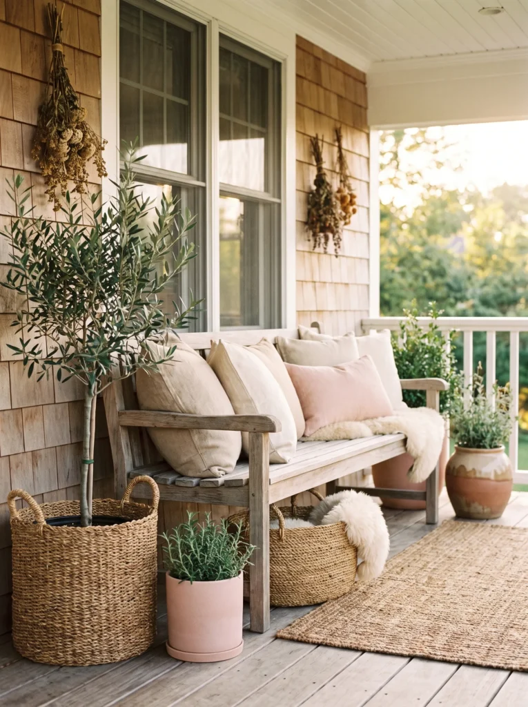
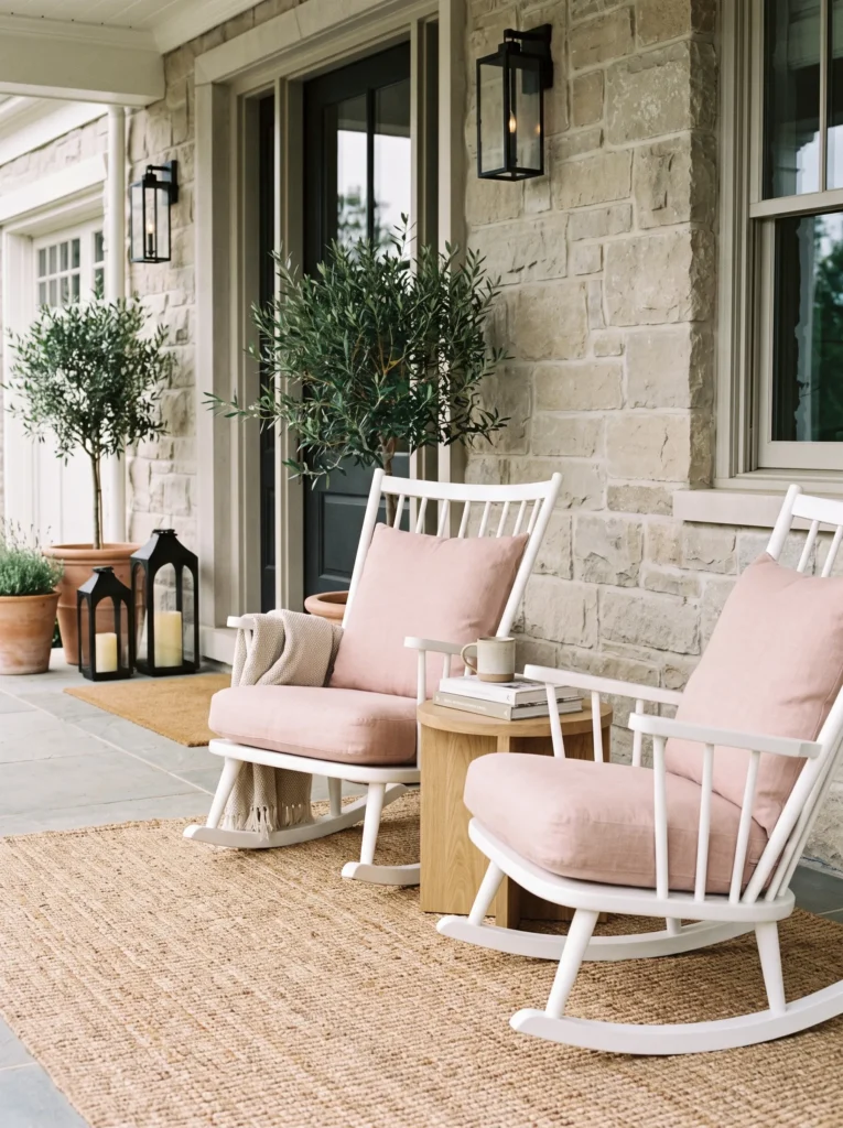
Natural textures are the easiest way to make soft pink feel mature and sophisticated. Wood, wicker, stone, linen, and woven baskets soften pink’s sweetness while adding warmth and depth. Compare: bright pink plastic furniture with matching accessories versus a light oak bench, woven baskets, linen cushions, and a few blush pink accents. The second space feels calmer because natural materials let pink complement the surroundings instead of competing with them.
Use Greenery to Keep It Fresh
Pink and green are one of nature’s most successful combinations. Healthy plants prevent pink décor from feeling flat or overly decorative — instead of more pink accessories, let greenery provide the visual interest. Large leafy plants, olive trees, lavender, ornamental grasses, flowering shrubs: texture, movement, seasonal variety. Green becomes the foundation; pink adds softness in carefully chosen places.
Decide the Feeling First
Before buying another pink accessory, ask: how do I want this porch to feel? Peaceful? Romantic? Fresh? Elegant? Relaxing? Welcoming? Answering makes decorating decisions easier — if a piece doesn’t contribute to that feeling, it doesn’t belong. This mindset shifts focus from collecting matching décor to creating an atmosphere that feels personal and balanced.
Choose Timeless Furniture
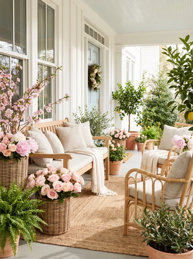
Furniture often determines whether a pink porch feels elegant or overly decorative. Let larger pieces provide a neutral foundation — white, warm wood, black metal, woven rattan — so pink accents stand out naturally without overwhelming. A natural teak bench with blush pink cushions looks far more sophisticated than a fully pink bench surrounded by matching accessories. Timeless furniture makes seasonal updates easy: refresh with cushions, flowers, or small pieces instead of replacing big furniture.
Mix Pink With Neutrals
Pink works best with room to breathe — one part of a balanced palette, not the main colour. Combinations that consistently look elegant: blush pink with warm white and light oak; dusty rose with beige and natural stone; soft pink with sage green; pale blush with charcoal accents; muted pink with woven rattan and linen. Each colour supports the others instead of competing. Limit the palette to three or four colours for cohesion.
Don’t Fill Every Corner
The classic themed-decorating mistake: styling every available space. A pink planter by the door, another on the steps, a pink wreath, pink lanterns, pink cushions, pink signs, pink flowers — individually attractive, together crowded. Elegant design relies on restraint. Leave some surfaces empty; let architectural details, natural light, and greenery become part of the design. Sometimes removing one item improves the look more than adding another.
Seasonal Touches Without Redesigning
A well-designed porch shouldn’t need a complete makeover every season. Build a timeless base and make small updates: spring flowering plants in soft pink; summer lightweight linen cushions and fresh greenery; autumn warm beige throws, muted terracotta planters, or dried grasses; holidays a simple evergreen wreath with soft blush ribbon. With a neutral foundation, small updates feel intentional rather than temporary. For more seasonal ideas, see our fall porch, Halloween porch, and Christmas porch guides.
Mistakes That Make Pink Porches Feel Overdone
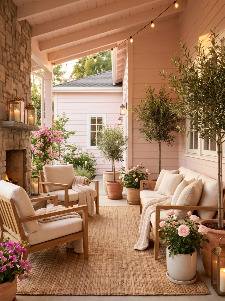
Choosing the brightest pink: vibrant pinks energize in small doses but overwhelm across a whole porch — muted, dusty, or warm blush tones look softer and more timeless.
Matching everything perfectly: a porch doesn’t need identical cushions, flowers, rugs, and accessories. Slight variation in complementary tones and natural textures looks more collected.
Ignoring texture: colour alone rarely creates an inviting space. Without wood, woven fibres, linen, stone, or greenery, even a beautiful palette feels flat.
Forgetting scale: several small pink decorations scattered around create visual clutter — one larger statement planter or a pair of well-chosen cushions has greater impact.
Following trends too closely: social media trends expire fast. Timeless furniture plus easily replaceable coloured accessories gives far more future flexibility.
The 60-30-10 Formula
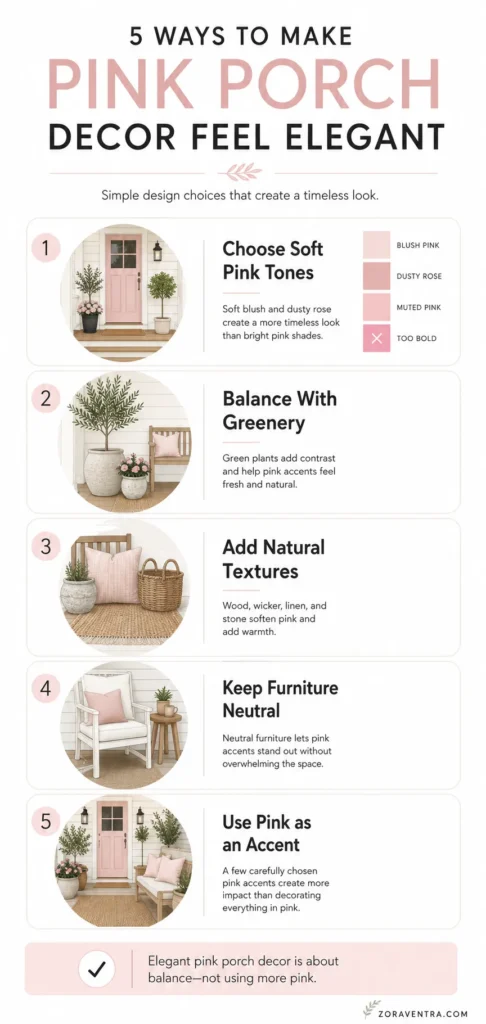
Unsure where to start? Try: 60% neutral foundation (white, beige, natural wood, soft grey); 30% natural texture (wicker, rattan, linen, stone, woven rugs, healthy greenery); 10% soft pink accents (cushions, planters, flowers, seasonal accessories). Not a strict rule — but an easy way to keep pink refined rather than overpowering. When neutral materials do most of the work, pink accents become more noticeable and far more elegant.
Before You Add Another Pink Accent
Pause before buying and ask: is this adding warmth or just more colour? Does it work with my existing furniture and materials? Am I using pink as an accent rather than the main focus? Will this still look beautiful next year? Does it make the porch calmer or more cluttered? Mostly “yes” answers mean a thoughtfully designed porch rather than a heavily decorated one. Sometimes the most elegant decision is letting the pieces you already love stand out.
Quick Answers
What shade of pink works best on a porch?
Muted tones — blush, dusty rose, muted mauve, warm pastel pink. They complement natural outdoor materials; bright bubblegum and neon pinks dominate and date quickly.
How much pink is too much on a porch?
When every element shares the colour, nothing stands out. Aim for roughly 10% pink accents (cushions, planters, flowers) against a 60% neutral foundation and 30% natural texture.
Can a pink porch work year-round?
Yes — build a timeless neutral base and update small elements seasonally: spring flowers, summer linens, autumn throws, a holiday wreath with blush ribbon. No full redesigns needed.
Affiliate Disclosure: As an Amazon Associate, I earn from qualifying purchases. If you click a link and buy, I may receive a small commission at no extra cost to you. Thank you for supporting my content!