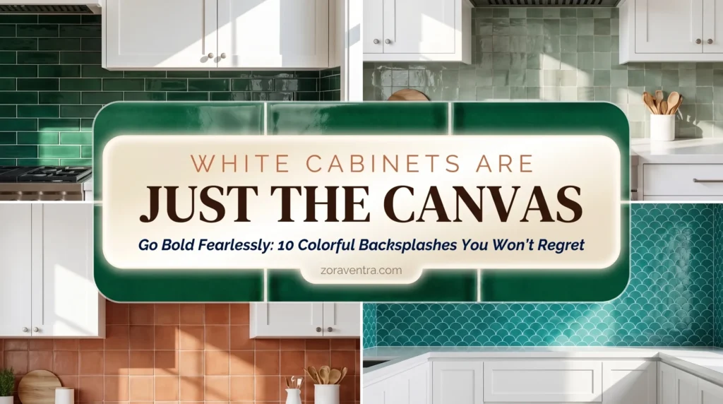
You did what every design show told you: installed crisp white cabinets — safe, timeless, great for resale. Now you’re standing in the kitchen feeling… bored. A little sterile. The backsplash is your last chance to inject actual personality. The fear is real: pick a loud color you’ll hate in three years. But bold doesn’t have to mean trendy. The secret is saturated colors with earthy undertones — never neon. Here are 10 color families that go bold without the regret, each with an honest longevity note.
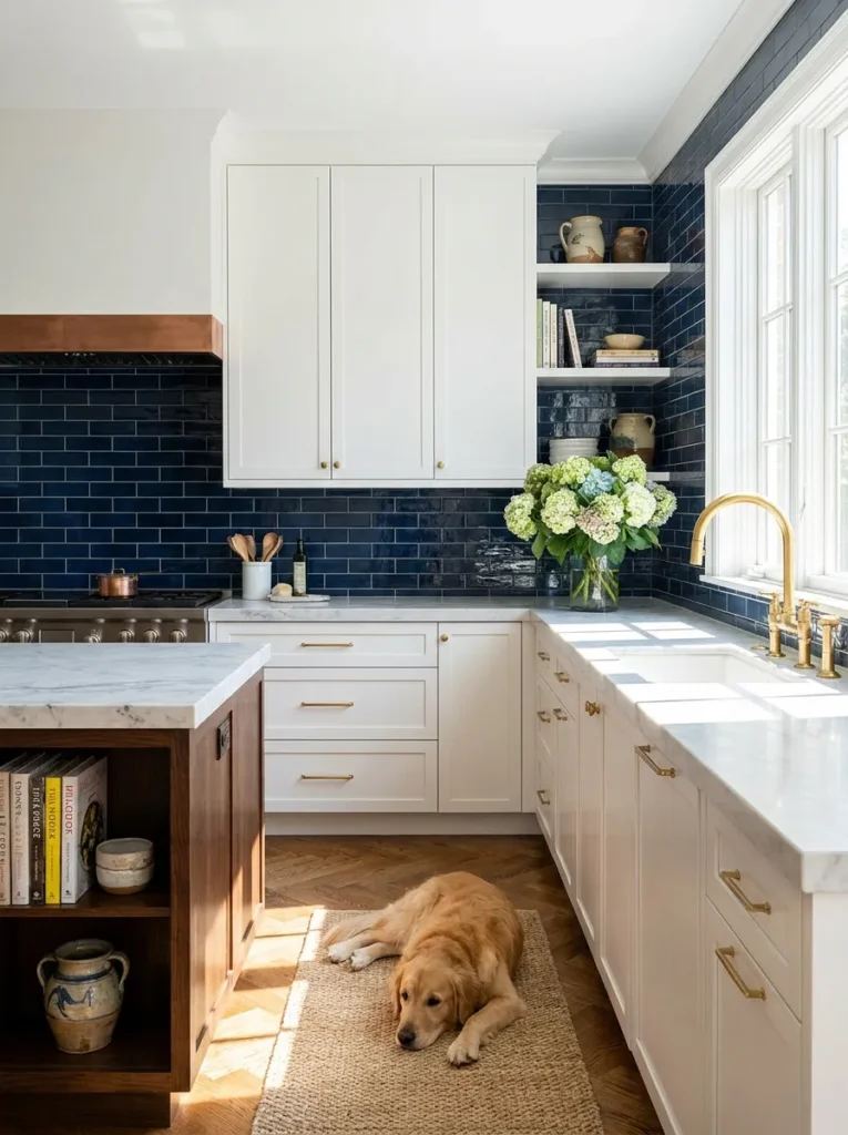
1. Deep Navy Blue (The Timeless Classic)
Think navy looks like a beach house? Go darker. Deep navy is the denim of interiors — it goes with everything. Glossy dark navy glass or ceramic against white cabinets: crisp, tailored, nautical, expensive. Longevity: high — navy reads as a neutral; you won’t tire of it.
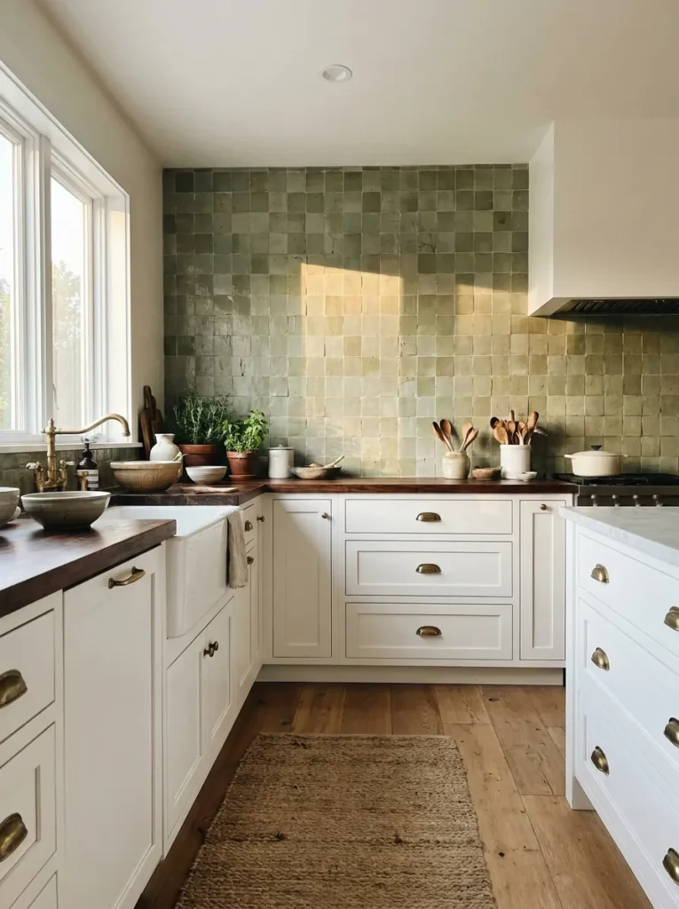
2. Dusty Sage Green (The Earthy Neutral)
Handmade-look zellige in muted grayish-green brings nature indoors without overwhelming. The imperfect edges and color variation keep it organic, not flat — perfectly balanced against clean white cabinetry. Longevity: very high — gray-brown undertones make sage a soft neutral. Try it: handmade-look dusty sage green subway tile.
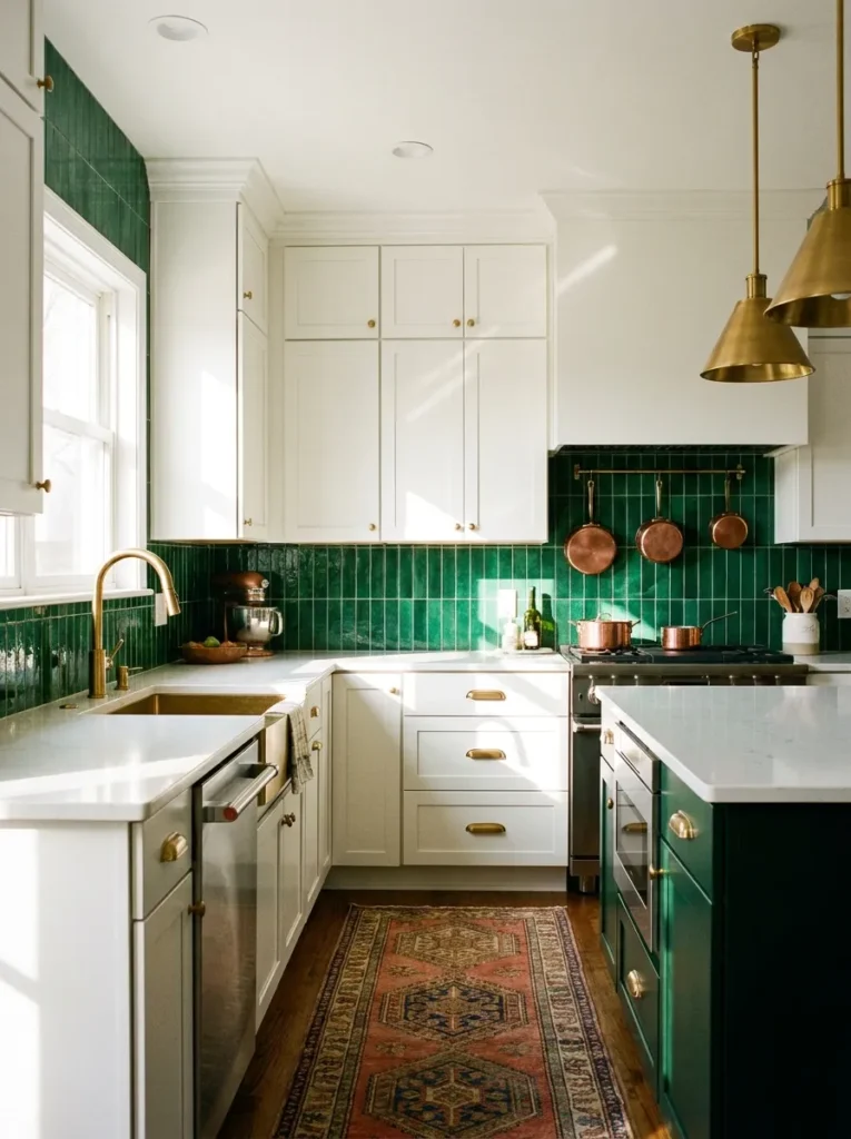
3. Rich Emerald Green (The Jewel Box)
Sage too quiet? Turn it up. Deep emerald in a vertical stack or glossy square tile against white cabinets is a showstopper — high-energy luxury. Tie it together with unlacquered brass hardware; green and gold is historically unbeatable. Longevity: medium-high — keep counters neutral (white quartz or marble) so the green doesn’t fight busy stone. Go bold: glossy emerald green ceramic tile.
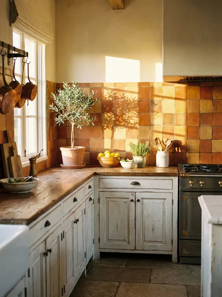
4. Warm Terracotta (The Sunbaked Fix)
All-white kitchens can feel physically cold. Terracotta — authentic clay or ceramic in sunbaked rusty orange-red — injects instant visual heat. Mediterranean villa energy. Creamy white grout ties it back to the cabinets. Longevity: high — one of humanity’s oldest building materials; inherently timeless. No contractor needed: peel-and-stick terracotta-look backsplash tiles.
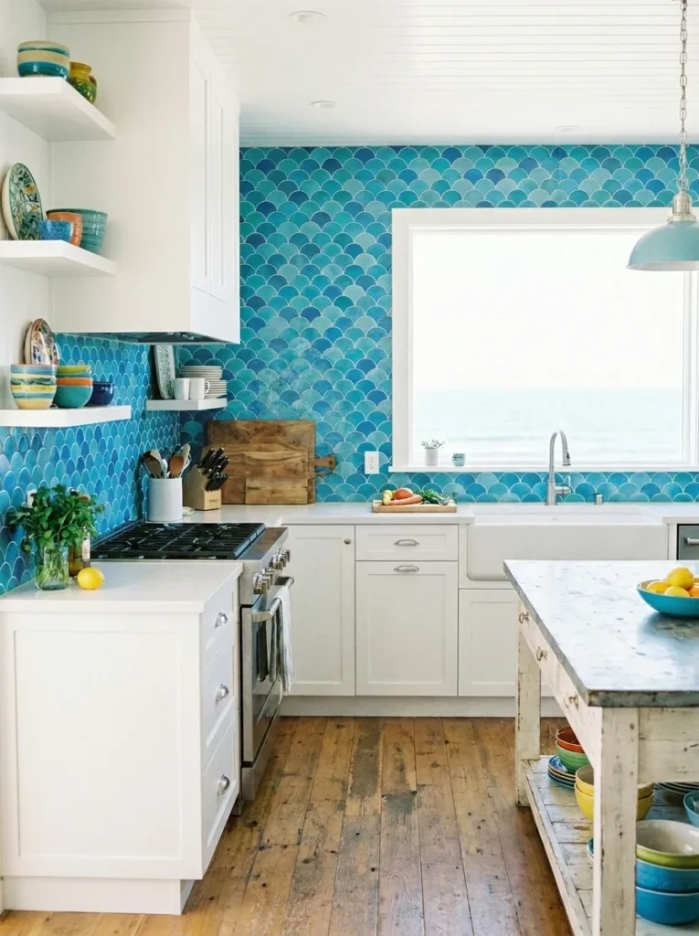
5. Ocean Blue Fish-Scale (The Coastal Glow)
Scalloped fish-scale tile in multi-tonal ocean blue: joyful, light-catching, fresh. The curves break up the boxy lines of white cabinets and rectangular counters. Longevity: medium — brilliant if your home leans coastal or eclectic; strict traditionalists may outgrow the shape.
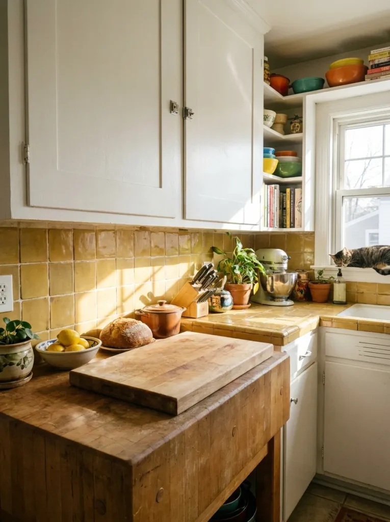
6. Muted Mustard Yellow (The Vintage Pop)
Yellow is the scariest wall color — done wrong, it’s a fast-food joint. Done right (muted mustard, ochre, saffron — never lemon), it’s rich, vintage, and happy against white. Pairs beautifully with warm wood shelves and vintage rugs. Longevity: medium — design for joy if you’re staying 10+ years; too taste-specific if selling in 3.
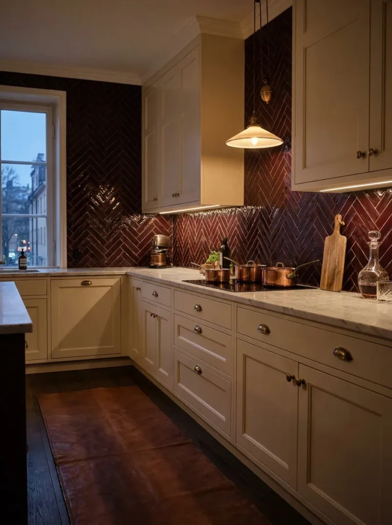
7. Oxblood / Deep Burgundy (The Moody Antique)
Deep burgundy tiles: dramatic, historic, romantic — old English pub meets tailored library. Against white cabinets the contrast is startlingly elegant, especially laid in herringbone. Longevity: medium-high — dark and grounded, it anchors like a good wine ages.
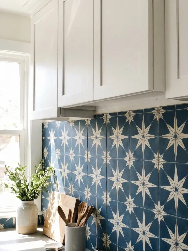
8. Patterned Encaustic (The Global Statement)
If solid color feels heavy, get color through pattern. Encaustic cement tile with a white background and a colorful motif (deep blue star, sage lattice): the white connects to your cabinets while the pattern brings the personality. Longevity: medium-high — stick to two-color patterns; they age like classic wallpaper; multi-color chaos doesn’t.
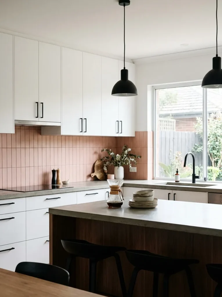
9. Soft Blush Pink (The Muted Modern)
Blush has grown up: matte, dusty pink with gray undertones (never bubblegum) reads as a sophisticated warm neutral. Stacked vertically, it flatters skin tones, warms the room, and pairs with both matte black and polished nickel hardware. Longevity: medium — keep it muted and dusty to stay timeless.
10. Counter-to-Ceiling Color (Go All In)
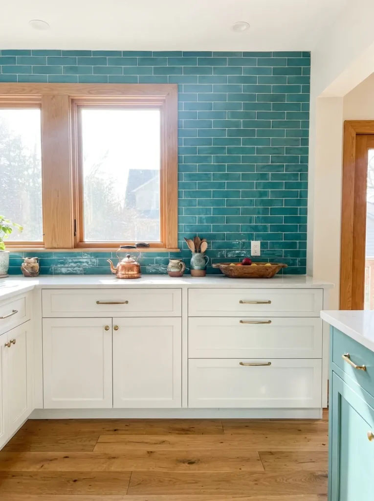
If you’re committing to bold, don’t do it halfway — an 18-inch strip of bright color can look like a racing stripe. Remove uppers on one wall and run the tile (teal, emerald, whatever you love) counter to ceiling. The whole wall becomes architecture; white lowers ground it. Longevity: high — full-wall tile reads as a deliberate structural choice, not an afterthought.
Longevity at a Glance
Navy, sage, terracotta: very low regret — read as neutrals. Emerald, oxblood, encaustic: medium-low regret — rich and grounded. Blush, mustard, fish-scale: medium regret — joyful but taste-specific.
Prefer pattern over color? Our subway tile pattern guide shows 9 layouts that make white tile look custom — and our boho backsplash ideas cover zellige, Moroccan, and terracotta in depth.
Quick Answers
What backsplash color goes best with white cabinets?
Navy blue and sage green are the safest bold choices — both read almost as neutrals. Terracotta adds warmth; emerald adds drama.
Will a colorful backsplash hurt resale value?
Earthy, saturated colors (navy, sage, terracotta) rarely hurt resale. Neon, primary, or highly taste-specific colors (mustard, blush) are riskier if selling soon.
How do I add color without committing to tile?
Peel-and-stick tiles in bold colors give you the look for under $100 and remove cleanly — ideal for testing a color before tiling for real.
Affiliate Disclosure: As an Amazon Associate, I earn from qualifying purchases. If you click a link and buy, I may receive a small commission at no extra cost to you. Thank you for supporting my content!